Inhae

@life@social.inhae.blog

I like learning languages and reading crime fiction, and my favourite thing is to read detective novels in the languages I’ve learned (Japanese, Korean and Chinese), so I mainly post about that + anything stationery, journaling, maybe cats (or fish?) and life in Korean sometimes.

Reading blog (private)
social.inhae.blog/@blog

395 posts 0 following 546 followers Joined Oct 20, 2024

Inhae @life@social.inhae.blog · 10:55

I made the mistake of looking at Pleco add-ons… :ablobgrimace: And so I discovered that they have the Xiandai Hanyu Guifan Cidian, which would be my first Chinese only dictionary :blob_owo: And it’s included in the professional bundle, and the bundle is the same price as the dictionary alone. Hard to resist…



Inhae @life@social.inhae.blog · 10:18

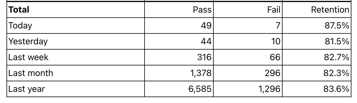
Today I tried to really focus on the words I was studying with Anki, rather than mindlessly rush through it just to be done with it. As a result, I’ve remembered more words today than I do on average.

I think I tend to forget that the real goal is not to study Anki every day but to actually memorise those Chinese words!

This gives me a new goal for 2025: bring my retention rate to 90%. I think that just being more focused when reviewing my cards would be enough to achieve this goal.

A table displaying performance statistics over different time periods, including today, yesterday, last week, last month, and last year. It shows the number of passes and fails, along with retention rates for each period.
Boosts 1Favourites 7
Inhae @life@social.inhae.blog · 09:20

In reply to @mollymay5000@sunny.garden

@mollymay5000
Good luck with your goals! Decluttering can be so hard, but I always tell myself that if the things I bought start becoming a cause of stress or guilt, then it’s time to get rid of them, even books. There’s so much to deal with already, can’t really let unread books become an additional source of distress.

Replies 1
Inhae @life@social.inhae.blog · 16:07

Currently reading ~~

The collection of short stories 烙印 by Udaru Oshita, published by Sogensha (2022). I read the first three short stories and loved each one of them :meow_hearts:

The novel 강남 형사 by 알레스K. I have been unlucky with my Korean readings lately, either losing interest or finding books too difficult. For now (100 pages into it), I can’t say that 강남 형사 completely managed to capture my interest. I do like some aspects of it though… we’ll how it goes!

I’m thinking of doing a “one Korean novel per month” type of challenge for 2025. It will help me go through the pile of unread books I have at home.

Favourites 1
Inhae @life@social.inhae.blog · 18:59

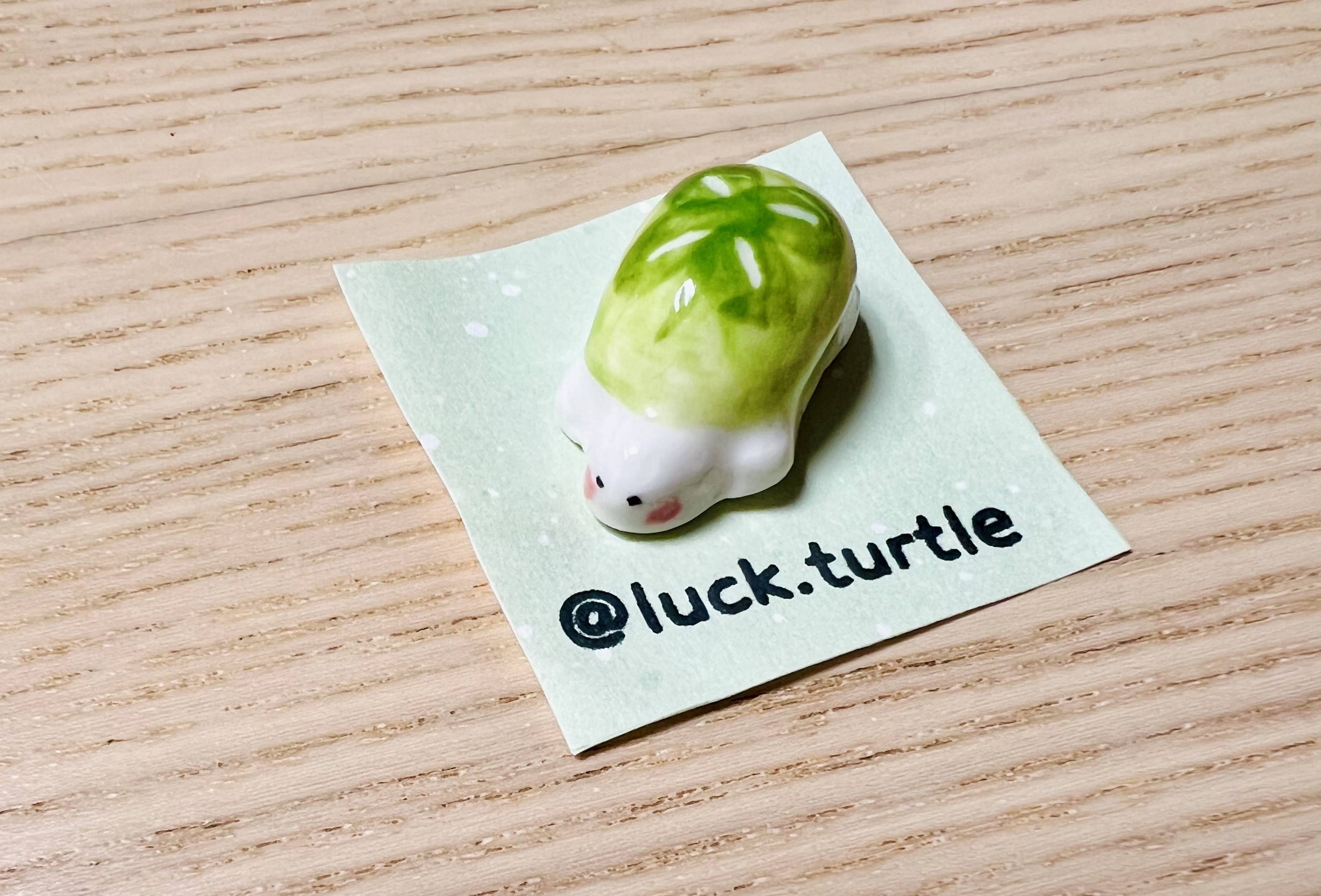
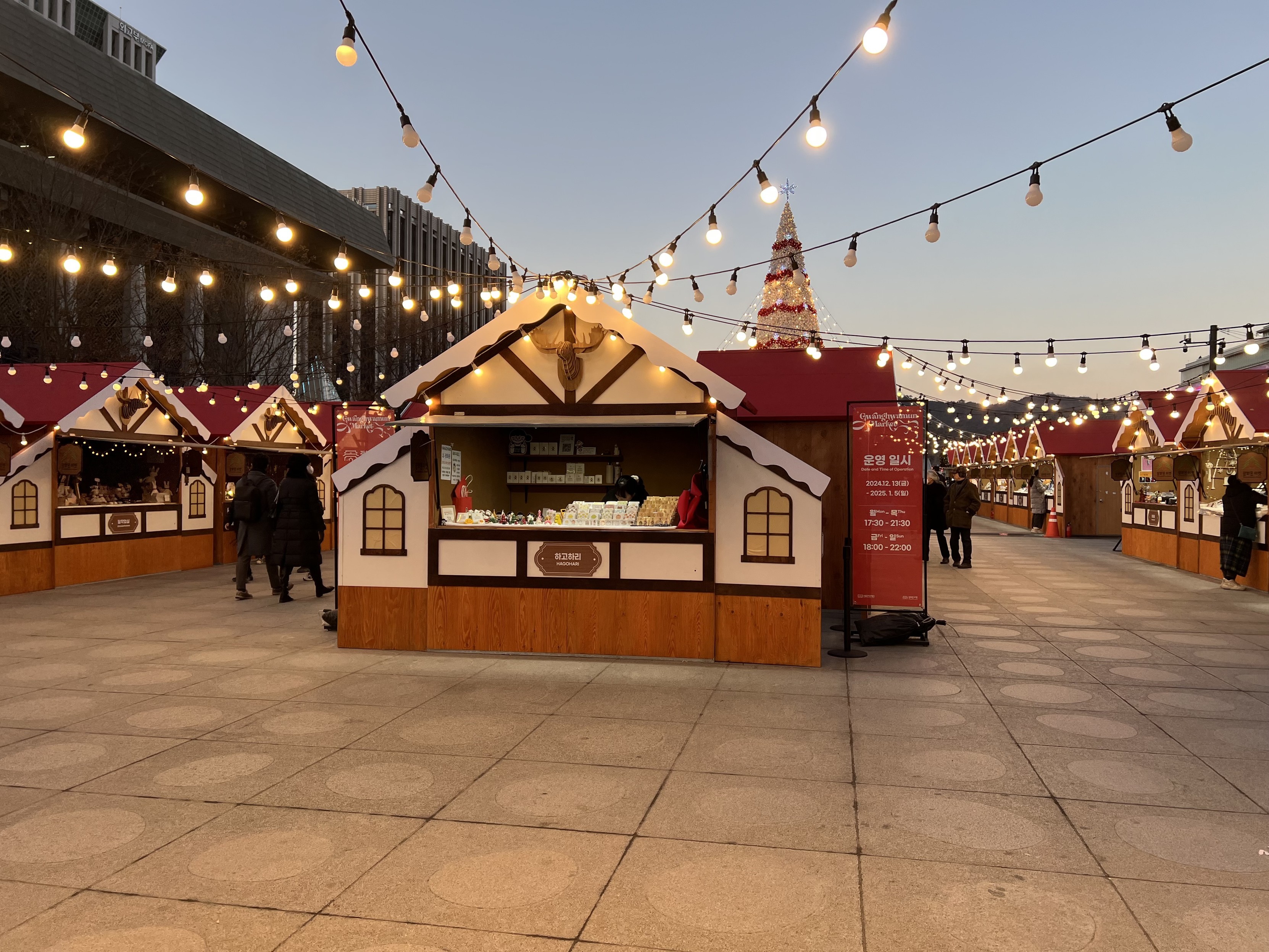
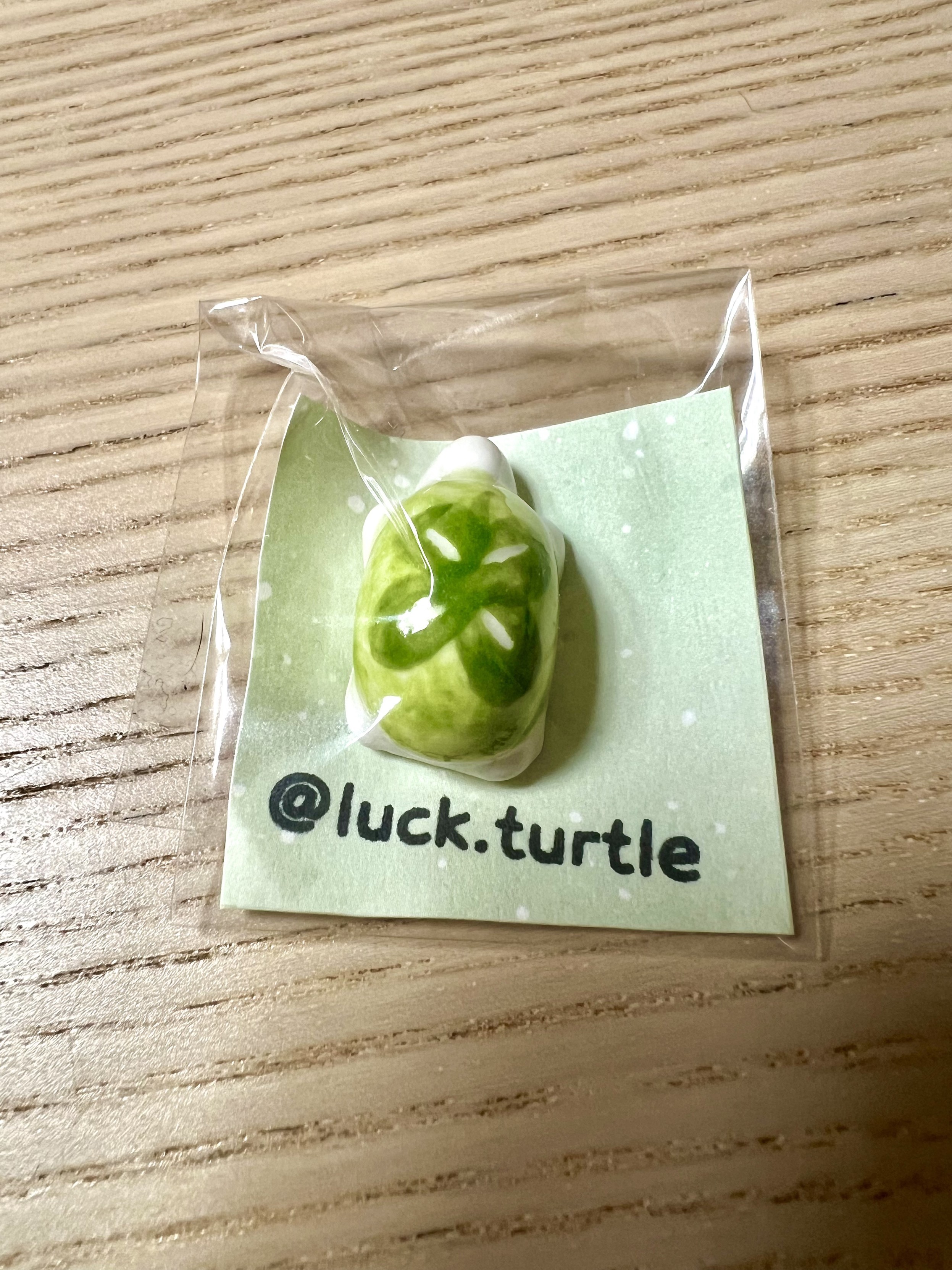
I went to the Gwanghwamun Market not expecting to buy anything but brought home this lucky turtle (행운의 거북이)! They’re handmade ceramic turtles, the stand was by far the most popular of the market. 🐢🍀

instagram.com/luck.turtle/

A festive outdoor market featuring wooden stalls with fake snow-capped roofs, decorative lights strung overhead, and a holiday tree in the background.
A small, green turtle figurine is displayed inside a clear plastic package on a wooden surface. The turtle has a leaf-like design on its shell and is sitting on a card featuring the handle "@luck.turtle."
Replies 1Boosts 1Favourites 8
Inhae @life@social.inhae.blog · 21:18

I recommended 十角館の殺人 by Yukito Ayatsuji to my husband who asked what the title was in Korean. I had no idea, but

十 십
角 각
館 관
の 의
殺 살
人 인

was worth a try. And yes, that’s the title. :meow_cool:

Replies 1Favourites 3
Inhae @life@social.inhae.blog · 11:41

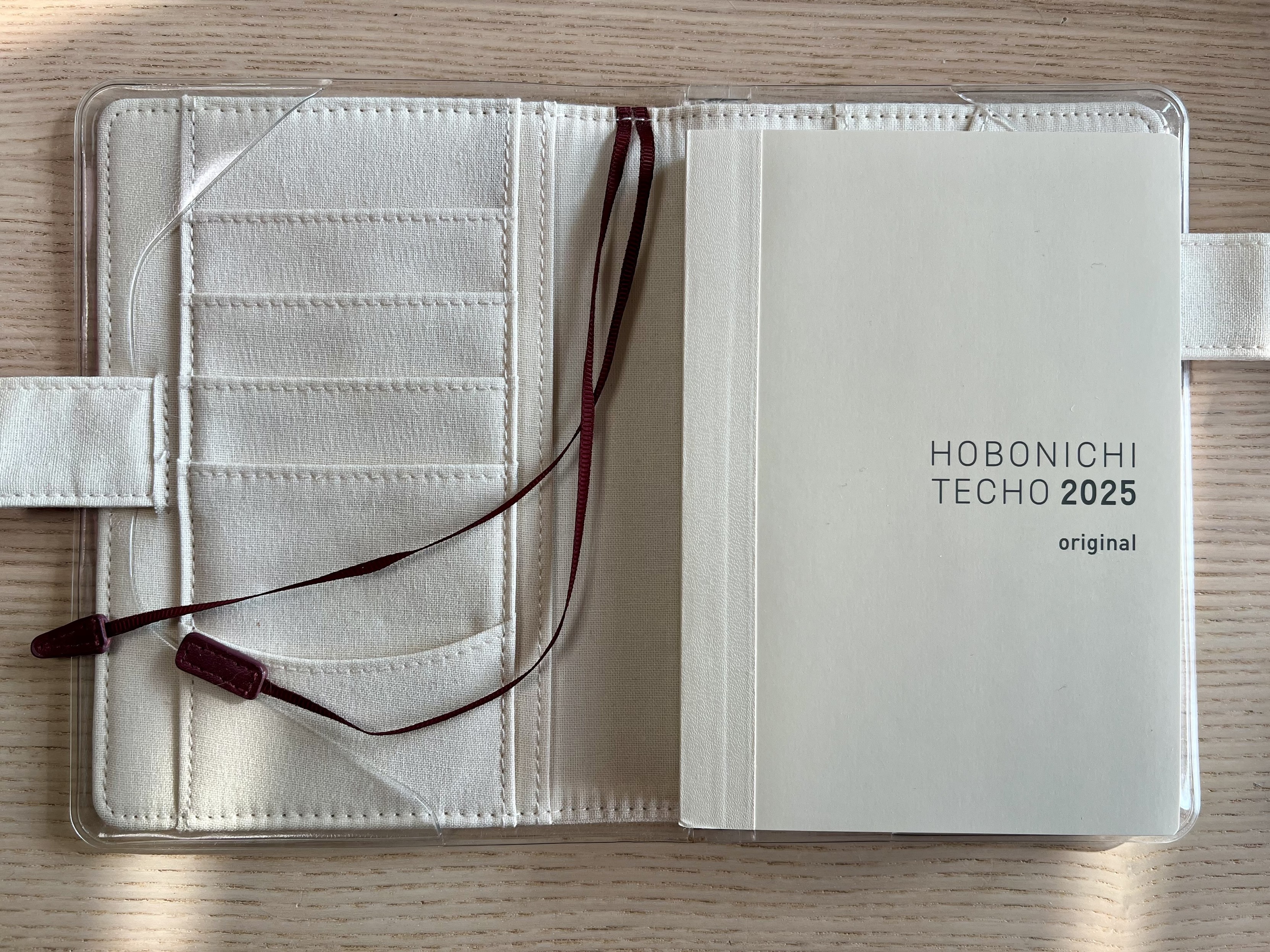
Best thing about January 1st is starting the new planner!

Happy New Year! 🎉

A Hobonichi Techo 2025 planner displayed on an open fabric cover with card slots and ribbon bookmarks.
Replies 1Favourites 10
Inhae @life@social.inhae.blog · 17:43

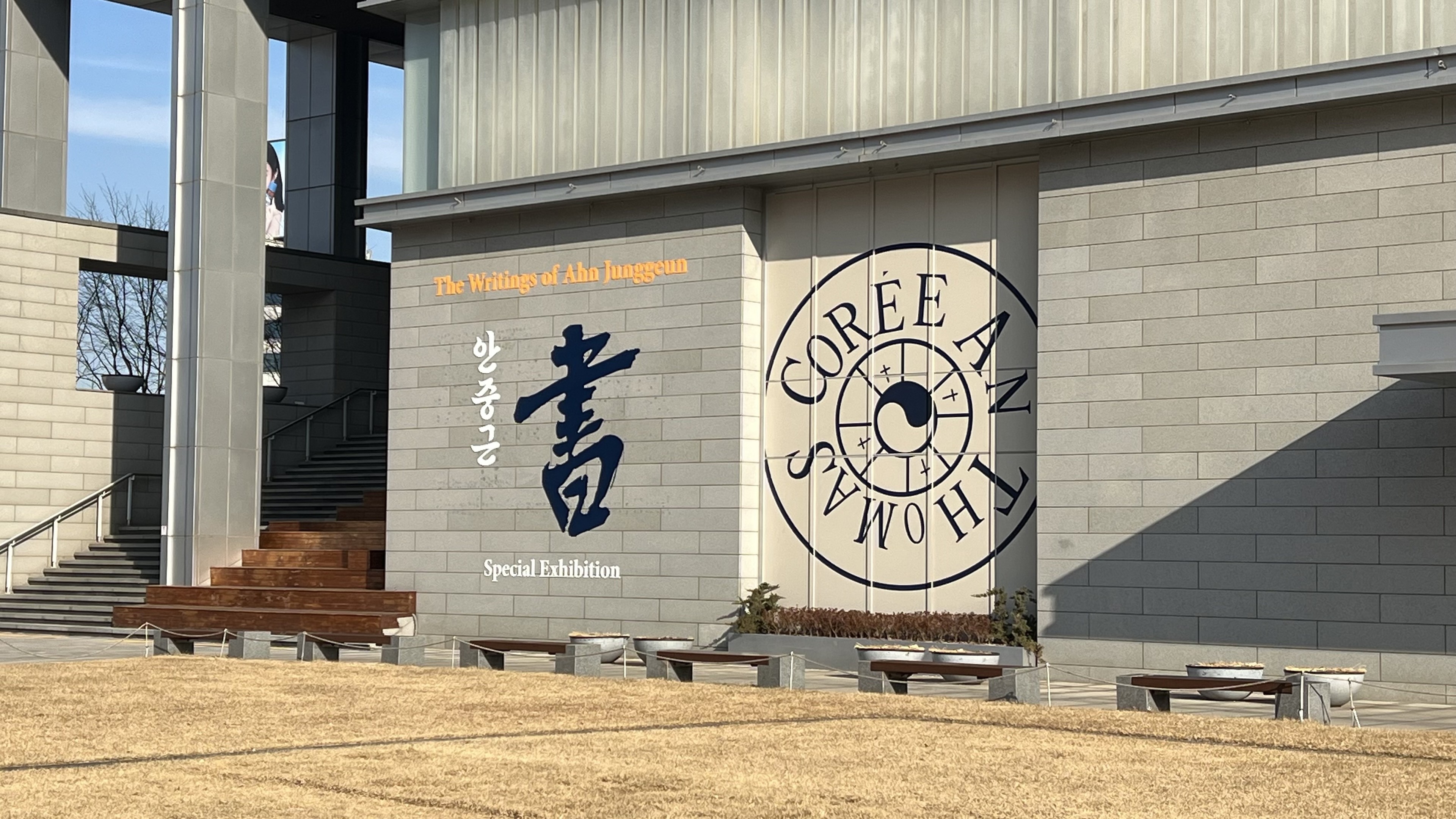
There’s an on-going exhibition of Ahn Junggeun’s writings at the National Museum of Korean Contemporary History. The exhibition is free and was very good, with explanations in Korean and English. A booklet was also available with reproductions of all the pieces exhibited.

The Writings of Ahn Junggeun 안중근 書(서), 대한민국역사박물관, until March 31th.

Façade of a modern building with a prominent exhibition banner. The text displays "The Writings of Ahn Junggeun" and "Special Exhibition," as well as a logo with the words “Corée An Thomas”.
Favourites 1
Inhae @life@social.inhae.blog · 10:36

In reply to @LevelUp@corteximplant.com

@LevelUp
I find that the rings are much more manageable when the planner is full, so what I do is fill it with blank pages, so that the page I write on is higher and closer to the top of the rings.

Replies 1Favourites 1
Inhae @life@social.inhae.blog · 18:29

In reply to @shiawase@mastodon.social

@shiawase
It would be great if “bold” used the corresponding font! I use @ font-face and I’ve downloaded and installed all the 9 variations of the font I’m using, so now I can play around with font weight :)

Replies 1
Inhae @life@social.inhae.blog · 18:22

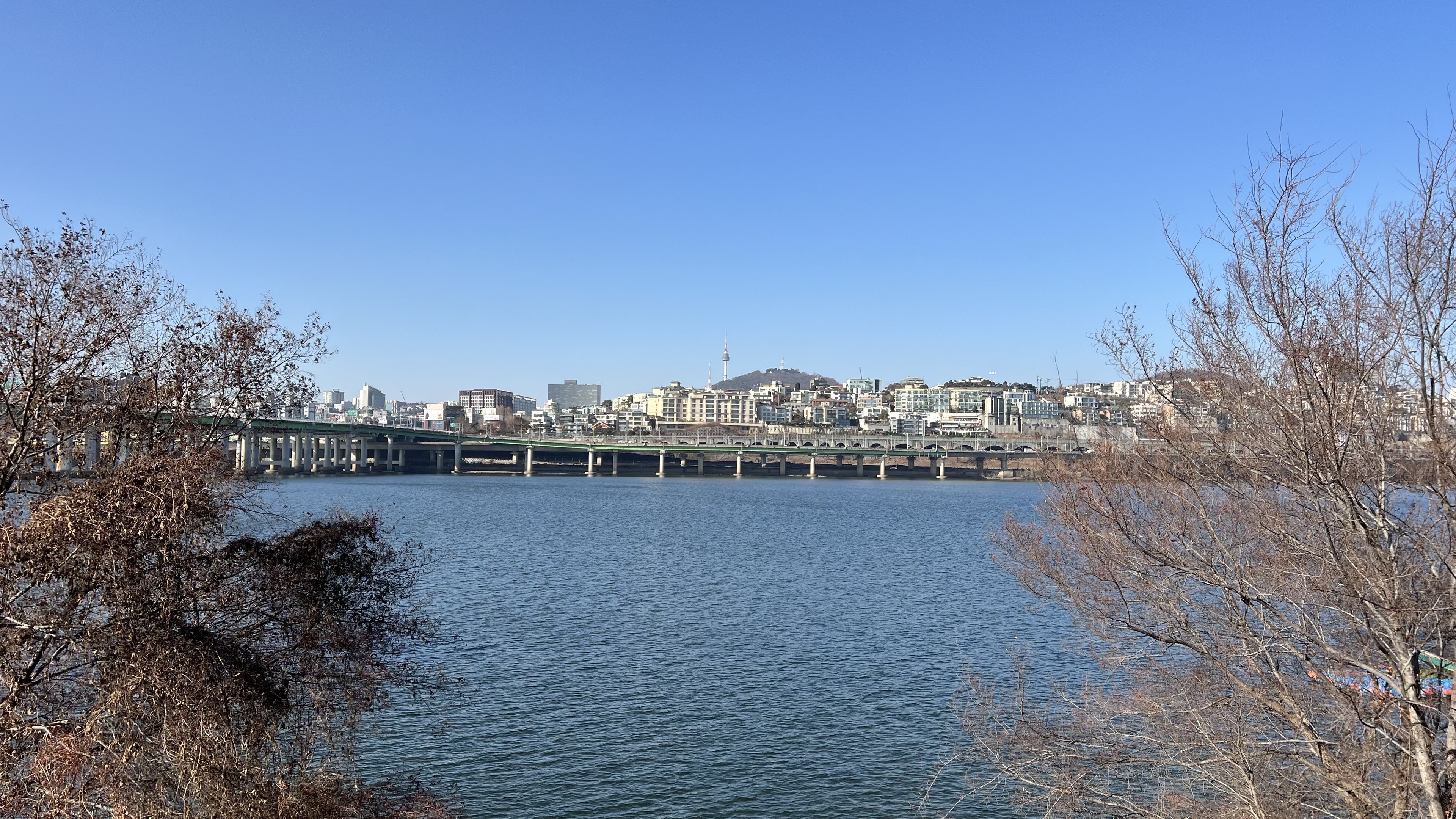
Cold bike ride this morning, 0C and strong NW wind. It still feels good to go out, but one/two hours is the max I can do with this kind of weather 🥶.

A view of the north bank on the Han river with Namsan visible in the distance.

View of a river under a clear blue sky. Leafless trees are in the foreground. Buildings are visible on the other bank with a small tower on a hill in the background.
Favourites 6
Inhae @life@social.inhae.blog · 18:14

@apschmidt@sharkey.world
So it looks better with serif, interesting!
But overall, I prefer sans serif fonts :)

Inhae @life@social.inhae.blog · 11:03

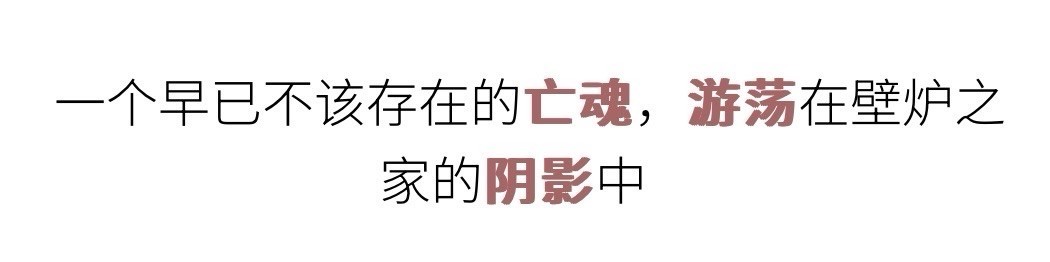
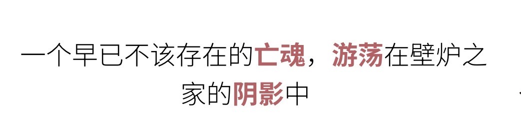
I don’t know why bold weight works so badly with Chinese characters, to the point where complex ones can become hardly readable... I realised recently that I needed to use another font rather than change the font weight of the words I’m studying.

Here is an example of an Anki card with highlighted words in bold (using font-weight: bold in css) VS using a bold font (in this case, Google Font Noto Sans Simplified Chinese bold).

A sentence in Chinese with highlighted words in red. The font is bold, but some strokes are so thick, the character becomes harder to read and it gives an overall messy impression.
Same sentence as previous picture, but the highlighted words are now in a much regular shape, are easy to read while still being in bold.
Replies 2Boosts 1Favourites 3
Inhae @life@social.inhae.blog · 10:08

@apschmidt@sharkey.world
Ce stollen a l’air délicieux!!